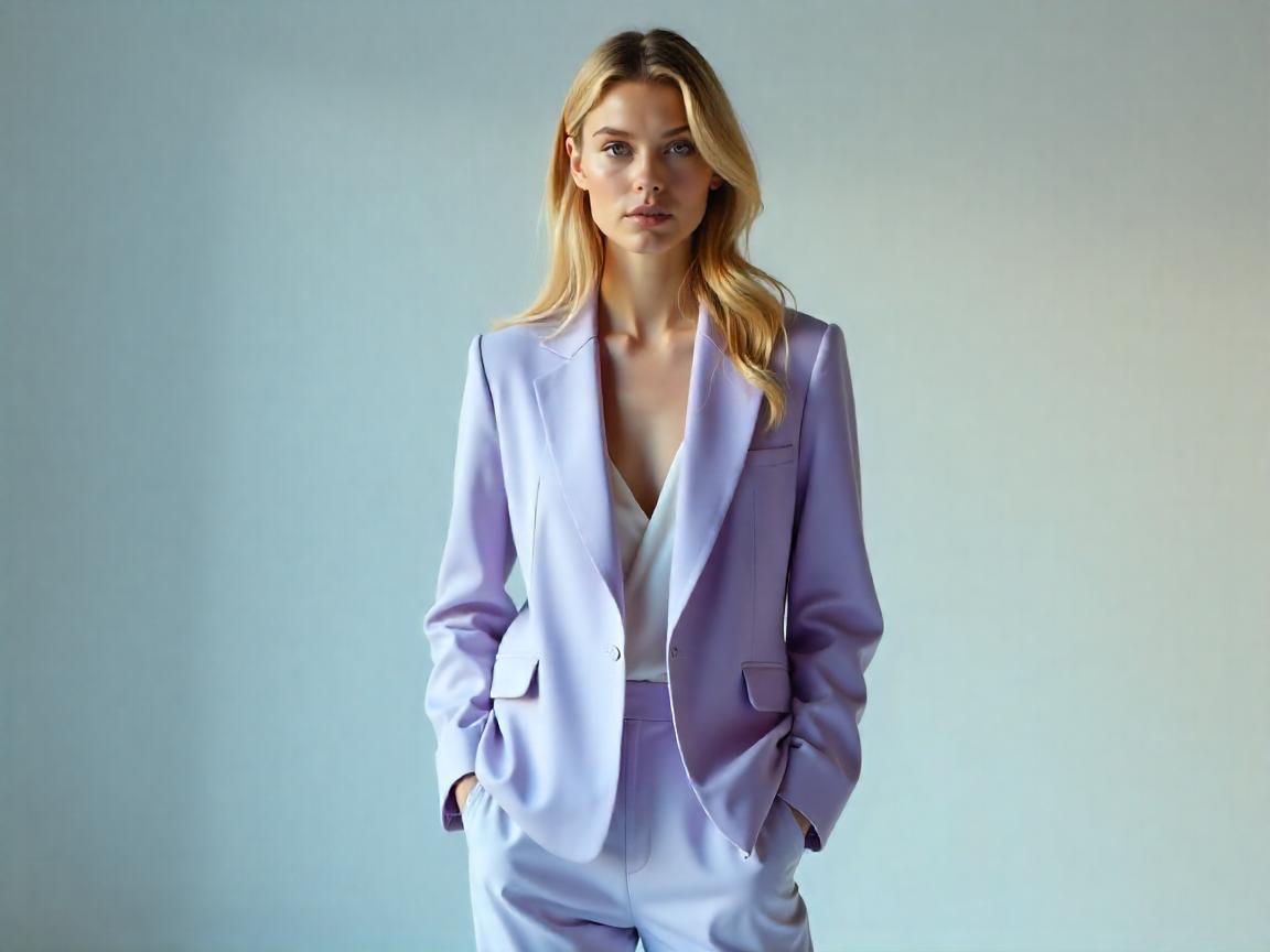
The Art of Color Coordination in Fashion
Color wields an extraordinary influence in fashion, serving as both a visual language and an emotional trigger that can transform an ordinary ensemble into a striking statement. The strategic use of color combinations allows individuals to convey sophistication, energy, or tranquility depending on the desired effect. This guide delves into the principles of color theory as applied to fashion, offering practical methodologies for selecting hues that complement not only each other but also the wearer’s unique complexion.
1. The Science of the Color Wheel and Its Application in Fashion
The color wheel, an essential tool for designers and stylists alike, organizes hues into a logical sequence that reveals their relationships. Primary colors—red, blue, and yellow—form the foundation, while secondary colors emerge from their mixtures, and tertiary colors further bridge the gaps between them. Understanding these connections enables the creation of outfits that are either harmoniously subdued or dynamically contrasting.
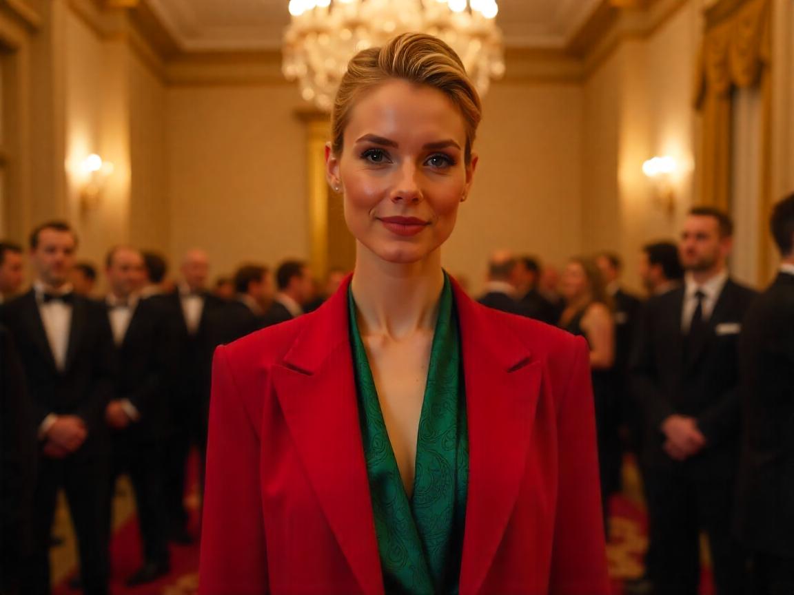
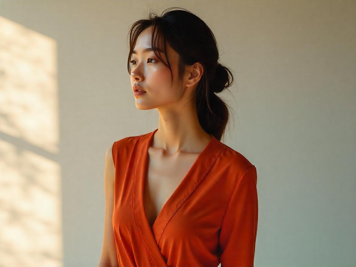
Complementary Colors Create Bold Statements
Key Color Harmonies in Fashion
Complementary Colors (High Contrast)
(Example: Red & Green, Blue & Orange)
Creates a bold, eye-catching effect.
Best for statement pieces or accessories.
Tip: Use one color as the dominant shade and the other as an accent (e.g., a navy blue suit with a burnt orange pocket square).
When two colors sit directly opposite each other on the wheel, they generate a high-contrast effect that commands attention. This striking interplay works exceptionally well when one shade dominates the ensemble while the other appears in measured accents, ensuring the look remains balanced rather than overwhelming.
 Analogous Colors Offer Subtle Harmony
Analogous Colors (Harmonious Blending)
(Example: Blue, Blue-Green, Green)
Offers a smooth, cohesive look.
Ideal for monochromatic or tonal outfits.
Tip: Vary shades and textures (e.g., pairing a sky-blue blouse with teal trousers and a mint scarf).
Colors adjacent to one another on the wheel, like sapphire, teal, and seafoam, blend seamlessly to create a cohesive and soothing aesthetic. This approach proves particularly effective in professional settings where understated elegance is preferred, or in monochromatic styling where texture variation adds depth.
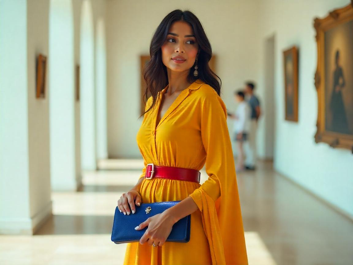
 Triadic Schemes Balance Vibrancy and Order
Triadic Colors (Balanced Vibrancy)
(Example: Red, Yellow, Blue)
Provides energy and variety without clashing.
Works well for creative or playful styles.
Tip: Let one color dominate while the others serve as accents (e.g., a yellow sundress with red shoes and a blue bag).
A triadic arrangement selects three colors evenly spaced around the wheel, such as violet, orange, and green, resulting in a lively yet balanced composition. To prevent visual chaos, one hue should anchor the outfit while the others serve as supporting elements through accessories or detailing.

2. Practical Color Combinations for Everyday Wear
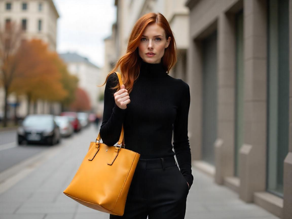
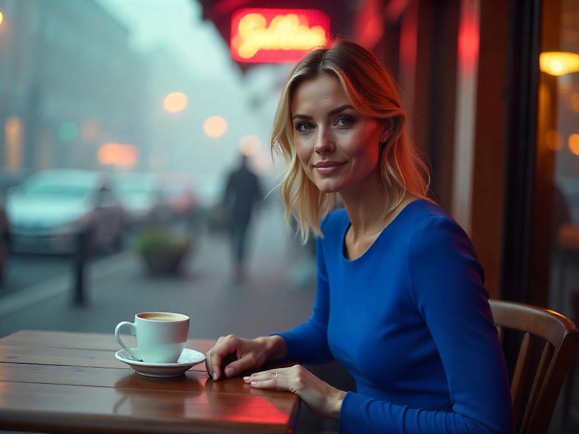
Neutral + Pop of Color (The Most Versatile Formula)
Base: Black, white, gray, beige, or navy.
Accent: One vivid hue (e.g., crimson, emerald, or cobalt).
Example: A charcoal-gray suit with a fuchsia silk scarf.
Neutral Foundations Enhanced by Strategic Accents
Building an outfit around neutral shades like charcoal, ivory, or taupe establishes a versatile base that allows for experimentation with bolder hues. Introducing a single vivid accent—such as a cobalt handbag against a beige trench coat—creates a focal point without overwhelming the senses.
 Monochromatic Dressing with Textural Variation
Monochromatic Elegance (Shades of One Color)
Creates sophistication and elongation.
Example: A head-to-toe camel outfit with varying textures (wool coat, silk blouse, suede boots).
Selecting varying shades of a single color family, from the palest blush to the deepest burgundy, crafts an illusion of elongation and sophistication. The key lies in incorporating diverse fabrics—matte wool against glossy silk, for instance—to maintain visual intrigue.
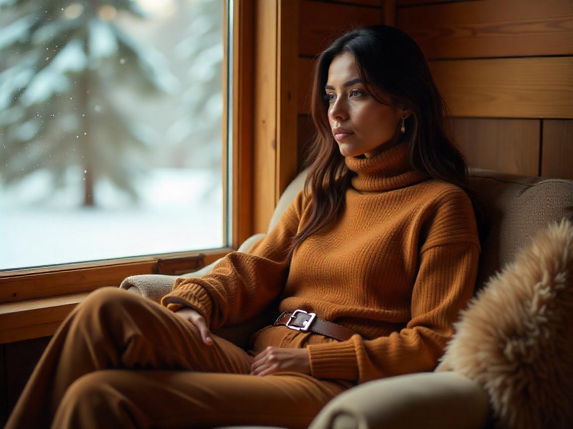
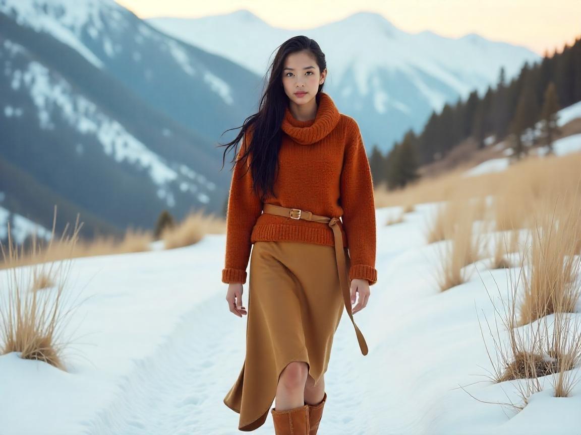
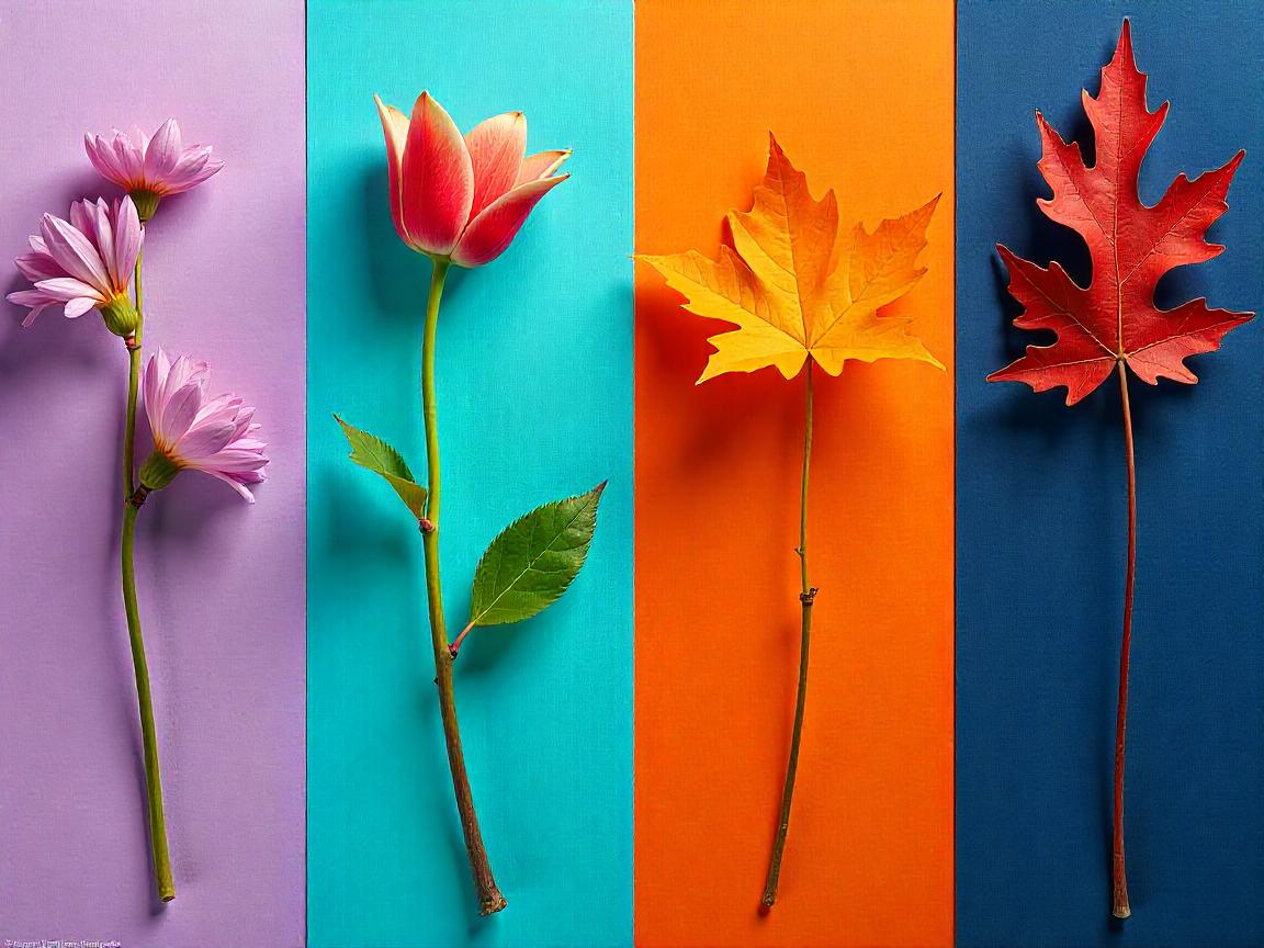
 Earth Tones Evoke Natural Elegance
Earth Tones (Nature-Inspired Palette)
Warm hues like olive, rust, and terracotta.
Perfect for autumn and winter fashion.
Example: A burnt orange sweater paired with chocolate brown trousers.
Drawing inspiration from landscapes, pairing warm terracotta with muted olive or rich chocolate brown yields an organic, grounded aesthetic. These combinations work exceptionally well in transitional seasons, effortlessly bridging casual and polished contexts.
3. Selecting Colors to Flatter Different Skin Tones
Cool Undertones (Pink or Blue Base)
Best Colors: Jewel tones (sapphire, emerald, ruby), icy pastels, and stark black/white.
Avoid: Overly warm shades like mustard or orange-brown.
Cool Undertones Harmonize with Jewel Tones
Individuals with rosy or bluish undertones in their complexion find that deep emerald, amethyst, and sapphire enhance their natural coloring, while overly warm shades like mustard or pumpkin can appear dissonant.
Warm Undertones Glow in Earthy Hues
Warm Undertones (Yellow or Golden Base)
Best Colors: Earthy reds, golden yellows, olive green, and warm browns.
Avoid: Harsh cool colors like neon blue.
Golden or olive-toned skin benefits from the richness of burnt sienna, ochre, and olive green, which amplify warmth, whereas icy pastels may wash out the complexion.
 Neutral Undertones Adapt to Muted and Soft Tones
Neutral Undertones (Balanced Between Warm & Cool)
Best Colors: Soft muted tones (dusty rose, sage green, lavender).
Advantage: Can experiment with both warm and cool palettes.
Those with balanced undertones possess the rare flexibility to wear both cool and warm shades, though muted variations like dusty rose or sage green often yield the most harmonious results.
4. Seasonal Color Recommendations for Timeless Style
| Season | Optimal Colors | Styling Recommendations |
| Spring | Pastel pinks, mint greens | Lightweight layers with delicate floral prints for a fresh, rejuvenated aesthetic. |
| Summer | Vibrant corals, turquoise blues | Airy linens and cottons in saturated hues, paired minimally to emphasize brightness. |
| Autumn | Rusty oranges, forest greens | Textured knits and suede accessories in deep, earthy tones for warmth and richness. |
| Winter | Navy blues, ruby reds | Luxurious fabrics such as velvet and wool in jewel tones to convey opulence and depth. |
5. Avoiding Common Color Mistakes in Fashion
Excessive color clashing often stems from incorporating too many competing hues without a dominant anchor, leading to visual chaos rather than intentional eclecticism. Another frequent misstep involves selecting shades that conflict with one’s natural undertones, which can be mitigated by reserving less flattering colors for accessories rather than garments near the face. Additionally, disregarding seasonal appropriateness may result in an outfit that feels dissonant with its environment, a pitfall easily avoided by adjusting saturation levels—opting for brighter tones in summer and deeper shades in winter.
Conclusion: Cultivating a Personal Color Identity
While color theory provides a structured framework for harmonious dressing, true style emerges when these principles intersect with personal preference and individuality. Experimentation remains crucial; by observing which combinations evoke confidence and joy, anyone can develop a signature palette that feels authentic.
Would you like further exploration into how specific textures interact with color or advanced techniques for pattern mixing while maintaining chromatic harmony?